Shadow Text using CSS
This tutorial explains how to create a text with shadow using CSS.
It has been tested and works with the following browsers:
- Firefox 2.0.0.4
- Internet Explorer 6.0
- Mozilla 1.7.13
- Opera 9.21
- Netscape 8.0.4
First let’s create a structure of our text container together with a text.
<div id=”wrapper”>
<span class=”firstlayer”>Text with shadow using CSS</span>
<span class=”secondlayer”>Text with shadow using CSS</span>
</div>
Now we are going to apply some formatting using CSS.
We are applying a position: relative; to the text container (#wrapper). This way all other elements within #wrapper which are using absolute positioning will be positioned relatively to the #wrapper not the body tag.
Then firstlayer and secondlayer get their absolute positions with secondlayer being 2px lower and to the right.
At the end we need to apply z-index to indicate which layer should be on top of the other.
html, body {
margin: 0px;
padding: 0px;
}
body {
background-color: #DDDFD7;
font-family: Verdana, Arial, sans-serif;
font-size: 11px;
text-align: center;
}
#wrapper {
width: 700px;
height: 200px;
margin: 20px auto 20px auto;
padding: 0px;
text-align: left;
position: relative;
border: solid 1px #fff;
}
.firstlayer {
font-size: 18px;
font-weight: bold;
color: #fff;
position: absolute;
top: 20px;
left: 20px;
z-index: 1;
}
.secondlayer {
font-size: 18px;
font-weight: bold;
color: #aaa;
position: absolute;
top: 22px;
left: 22px;
z-index: 0;
}
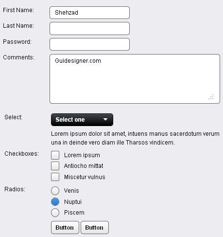 A Light weight, small framework for beautiful forms: Ideal Forms
  How to Start a Functioning Website Under Thirty Dollars 2021?
  The HTML5 Time Element Is Back and Better Than Ever
  Mozilla Introduce Firefox 9, with Speed and less memory improvements
 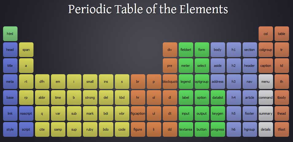 Periodeic table of HTML5 Elements, arrange by type.