Rounded Corner Boxes the CSS3 Way
While the CSS working group still seem to be arguing over the exact syntax, Dave Hyatt went ahead and implemented the currently suggested mechanism into Safari. The technique is fiendishly simple, and I think we’ll all be a lot better off once the W3C stop arguing over the details and allow browser vendors to get on and provide the tools we need to build better websites. 
To create a CSS3 rounded corner box, simply start with your box element and apply your 4 corner images, separated by commas.
.box {
background-image: url(top-left.gif), url(top-right.gif), url(bottom-left.gif), url(bottom-right.gif);
}
We don’t want these background images to repeat, which is the normal behaviour, so lets set all their background-repeat properties to no-repeat.
.box {
background-image: url(top-left.gif), url(top-right.gif), url(bottom-left.gif), url(bottom-right.gif);
background-repeat: no-repeat, no-repeat, no-repeat, no-repeat;
}
Lastly, we need to define the positioning of each corner image.
.box {
background-image: url(top-left.gif), url(top-right.gif), url(bottom-left.gif), url(bottom-right.gif);
background-repeat: no-repeat, no-repeat, no-repeat, no-repeat;
background-position: top left, top right, bottom left, bottom right;
}
As well as using multiple background images, CSS3 also has the ability to create rounded corners without the need of any images at all. You can do this by setting the border-radius property to your desired value as seen in the next example.
.box {
border-radius: 1.6em;
}
This technique currently works in Firefox/Camino and creates a nice, if somewhat jagged rounded corner. If you want to create a box that works in both Mozilla and WebKit based browsers, why not combine both techniques and see what happens.
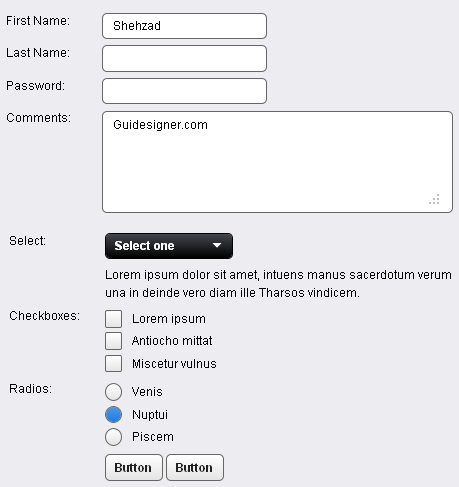 A Light weight, small framework for beautiful forms: Ideal Forms
 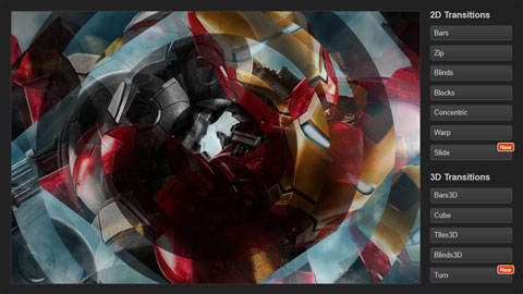 CSS3 Powered jQuery Image Slider for 2D or 3D transitions – Flux Slider
  How to Start a Functioning Website Under Thirty Dollars 2021?
  The HTML5 Time Element Is Back and Better Than Ever
  Mozilla Introduce Firefox 9, with Speed and less memory improvements
 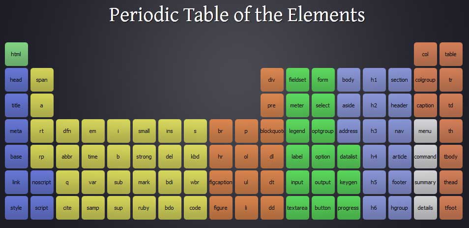 Periodeic table of HTML5 Elements, arrange by type.