How to make sexy buttons with CSS- Free & Easy
This tutorial will teach you how to create pretty looking textual buttons (with alternate pressed state) using CSS. Dynamic buttons save you heaps of time otherwise spent creating graphics and will basically make you a happier person at the end of the day. Here’s what you’ll get:

Sliding doors
Since we want our buttons to be über-flexible, we’ll have to make the background image expand with the size of the button’s text. For that, we’ll use the beloved sliding doors technique; two complementing images creating the illusion of a single, stretching image.
Our button will be a basic <a> tag with a nested <span>, each containing a different slice of the background image. Here’s what the HTML looks like:
<a class=”button” href=”#”><span>Bring world peace</span></a>
Nothing out of the ordinary, right? Next, we need to come up with a crisp design for our button in both normal and pressed state. Here’s what I’m thinking:

We will include both states in a single image. To switch between normal and pressed state, we’ll simply shift the background image vertically, revealing the alternate button state. This CSS based approach allows us to perform the switch without the need for any JavaScript trickery. Let’s merge these two and apply the sliding doors cut. The part of the image that will accomodate the button text will be set to a reasonable 300px. The height we’ll set to 24px.

Styling the button
Finally, we need a fair bit of CSS to bring all this together. Since we might want to line up several buttons horizontally, I decided to float them by default. (Floating them also makes the buttons wrap nicely.)
.clear { /* generic container (i.e. div) for floating buttons */
overflow: hidden;
width: 100%;
}
a.button {
background: transparent url(‘bg_button_a.gif’) no-repeat scroll top right;
color: #444;
display: block;
float: left;
font: normal 12px arial, sans-serif;
height: 24px;
margin-right: 6px;
padding-right: 18px; /* sliding doors padding */
text-decoration: none;
}
a.button span {
background: transparent url(‘bg_button_span.gif’) no-repeat;
display: block;
line-height: 14px;
padding: 5px 0 5px 18px;
}
Note: Make sure the span’s vertical padding (5 + 5) and line-height (14) amount to the total height of the button (24). Using a different padding, means setting a different height.
We now have a pretty looking button, but it doesn’t exactly give us much visual feedback when we press it. So let’s add that finishing touch of CSS:
a.button:active {
background-position: bottom right;
color: #000;
outline: none; /* hide dotted outline in Firefox */
}
a.button:active span {
background-position: bottom left;
padding: 6px 0 4px 18px; /* push text down 1px */
}
One extra measure for IE
Although hardly catastrophic, IE does not return the button to its normal state whenever it’s released. To force such behaviour, we need to add a tiny bit of JavaScript to the <a> tag:
<a class=”button” href=”#” onclick=”this.blur();”> … </a>
To submit forms with this type of button, simply add more calls to the button’s onclick event.
 A Light weight, small framework for beautiful forms: Ideal Forms
  How to Start a Functioning Website Under Thirty Dollars 2021?
  The HTML5 Time Element Is Back and Better Than Ever
  Mozilla Introduce Firefox 9, with Speed and less memory improvements
 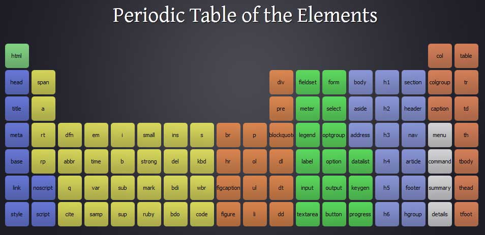 Periodeic table of HTML5 Elements, arrange by type.