Best Tips for Every Web Designer, Just Starting Out Should Know
There are many aspects of creating a website design. Web designers often have to play multiple roles and be very knowledgeable about building effective and usable site layouts.

Most of the lessons you’ll learn in web design comes from work experience; learning is an iterative process and there is no better way to gain knowledge than to make mistakes (and then and learning from them).
In this article, we discuss 10 essential and general tips that every novice web designer should know.
1. Optimize Web Graphics for Better Page Load Times
Learn how to optimize your web graphics by selecting the proper format and making sure that it’s as small as it can possibly be. Even though people are advancing to broadband connections, there are still quite a few who use dial-up internet connections. Additionally, with the emergence of mobile device technologies that don’t necessarily have broadband-like speeds, having slow page load times due to image file sizes can turn users off.
Here a general rule of thumbs for picking the right file format: images that have solid colors are best saved as PNGs and GIFs, while images with continuous colors (such as photographs) are best saved as JPGs.

There are plenty of tools available at your disposal that will help you further optimize your images and lower their file sizes, check out this list of tools for optimizing your images.
By limiting the number of images you use to the bare minimum, being smart about using images, and reducing file sizes as best as you can, you will significantly cut down page response times of a web page and improve your web page performance.
2. Keep it Clean and Simple
A good web design is not just one that looks visually appealing, but also one that is user-friendly. A clean and simple web design typically ends up being a high-usability web design that is not confusing to interact with.
By having too many site features and components on a page, you risk the chance of distracting website viewers from the purpose of the website. Make sure each page element has a purpose and ask yourself the following questions:
- Does the design really need this?
- What does this element do and how does it help the user?
- If I remove this element all of a sudden, will most people want it back?
- How does this element tie into the goal, message, and purpose of the site?
Additionally, though it may be super awesome to come up with a new concept or interface design pattern for your website, make sure that the design is still accessible and intuitive to your users. People are accustomed to common interaction patterns, site features, and web interfaces – and if your design is truly unique, make sure it’s not too obscure and puzzling. Be creative, but also keep it simple.
3. Navigation is the Most Important Thing You Will Design
The most essential site feature is the website’s navigation — without it, users are stuck whatever page they happen to land on. With that obvious fact out of the way, we’ll talk about some important points to consider when constructing a navigation scheme.
First, it’s very important to put enough time and a lot of planning on a site’s navigation structure. This is common sense, but it’s still surprising how many web designs take site navigation for granted.
Placement, style, technology (will it use JavaScript or just CSS?), usability, and web accessibility are just some of the things you need to consider when creating the navigation design.
Your navigation design should work without CSS because of text-based browsers. Poke fun of text browsers all you want, but they are still prevalent in many mobile devices. Perhaps more importantly, navigation that works with CSS disabled is accessible (99.99% of the time) via screen readers.

Navigation should be accessible and usable without the need for client-side technologies such as JavaScript or Flash, which users may not have enabled or installed for various reasons such as security or company policy.
It is imperative that you have a good navigation system in place that is located at a highly-visible location. A good navigation is detectable as soon as the web page loads without having to scroll down the web page. This is where keeping it clean and simple plays a major role: a complex and unconventional design can lead to user confusion.
Users must never wonder, even for a split second, “Where is the site navigation?”
For sites organized in a hierarchical, multi-level manner, make sure that it is easy to navigate from between parent and child web pages. In addition, it should be easy to reach top-level pages (such as the site’s front page) from any webpage.
The main goal of your site navigation is to allow users to get to their desired content with as few actions and with as little effort on their behalf as possible.
4. Use Fonts Wisely and Methodically
Though there are thousands of fonts out there, you can really only use a handful (at least until CSS3 is fully supported by major browsers). Make it a point to stick to web-safe fonts. If you don’t like web-safe fonts, consider a progressively-enhanced web design that leverages sIFR or Cufon.
Keep font usage consistent. Make sure that headings are visually-different from paragraph text. Use white space, tweak line-height, font-size, and letter-spacing properties to make content pleasant to read and effortlessly scannable.
Perhaps one of the things that web designers often get wrong is font-sizes. Because we want to fit as much text as we can in a web page, we sometimes set font sizes to uncomfortably small sizes. Try to keep font sizes at and above 12px if possible, especially for paragraph text. While many people face no difficulty reading small text sizes, think about older users and persons with low-vision and other types of vision impairment.
5. Understand Color Accessibility
After talking about fonts, we also need to point out the importance of using the right colors.
You need to consider color contrast of background and foreground colors for readability and for users with low-vision. For instance, black text on white background has a high-contrast, while orange text on red background will make you strain your eyes.

Also, use colors that are accessible to users with particular forms of color-blindness (check out a tool called Vischeck that will help you test for certain types of color-blindness).
Some color combinations work well only when the color is used as a foreground color instead of a background color. Take for example, dark blue text on a pink background versus but pink text on blue background, same colors but different levels of readability and reading comfort. It is important not only to get a good color combination but also to apply it to the right elements on the page.

6. You Need to Know How to Write Code Yourself
With various WYSIWYG editors flooding the market, it has become as simple as 1-2-3 to design a site. However, most of these editors insert unnecessarily code junk, making your HTML structure poorly designed, harder to maintain and update, and causing your file sizes to bloat.
By writing the code yourself, you come out with clean, crisp, and terse code that’s a pleasure to read and maintain; code that you can be proud to call your own.
Knowing how to use a WYSIWYG or an IDE with a visual preview does not excuse you from learning HTML and CSS. You have to know what’s going on in order to create effective, semantic, and highly-optimized web designs.
7. Don’t Forget Search Engine Optimization
A good designer should always remember to keep the basics of SEO in mind when designing a site. For example, structuring web content so that important text are represented as headings (i.e. page title and logo). This is where learning how to code properly comes in handy. Knowing correct, semantic, and standards-based HTML/CSS – you will quickly realize that divs are better than tables for web layouts not only for accurate representation of site content, but also for search engine rankings; you will also know that CSS background text image replacement is a good idea.
8. Understand that People are Impatient
People on an average spend only a few seconds before deciding whether they want to read more or navigate away to another site. Therefore, you as a web designer have to device a way for encouraging users to choose the former option within those precious seconds.
Know that not many visitors will scroll down to view the entire contents of the page if what they see at the top does not interest them. Remember to keep your important elements on the top where they are easily visible, but also do not overcrowd the top half of the page which can intimidate users and turn them off from reading further down the page. Consider the top half of a web design a selling point: be a salesman, make people buy into the notion that they want to see what else is on your site.
9. Learn About (and Be Aware of) Browser Quirks
One of the things you must know as a web designer is that your work operates in a finicky and unpredictable environment: web browsers. It’s not enough that your designs work on a few web browsers, they need to work in as many browsing situations as you can possibly afford. Before production – test your prototypes using tools like Browsershots.

10. Make Designs that are Flexible and Maintainable
A good web designer makes sure that the site can easily be updated or modified in the future. Designing websites that are malleable and easy to maintain is a sign of a great web designer. Make your work as modular as possible by separating style from structure.
Know that our industry is dynamic and still young – things change in a very short amount of time. Keeping this thought in mind will promote the creation of flexible web designs.
What are your web design tips?
If you have more tips to share to beginning web designers – kindly share them in the comments.
 How to Start a Functioning Website Under Thirty Dollars 2021?
 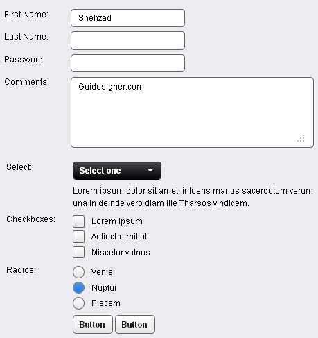 A Light weight, small framework for beautiful forms: Ideal Forms
 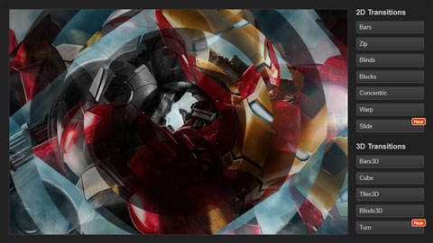 CSS3 Powered jQuery Image Slider for 2D or 3D transitions – Flux Slider
  Now Easy to Convert Websites Into Mobile Quickly: Mobilize.js
  The HTML5 Time Element Is Back and Better Than Ever
  Mozilla Introduce Firefox 9, with Speed and less memory improvements
 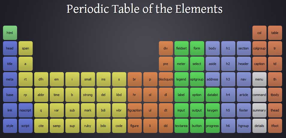 Periodeic table of HTML5 Elements, arrange by type.