Best Navigation Options, Help Users to Navigate Through Your Website Effectively
A website can offer readers at least 12 different navigation options. Not all of them are applicable to every website.
However, a quality website should always offer a range of navigation options.
![]()
1. Classification Path Navigation a.k.a Breadcrumbs
Classification path navigation is generally found near the top of the Web page, often underneath the masthead. This navigation shows the various parts of the particular classification tree in which a particular document or section of the website is located.
Let’s say you arrive at the homepage of a website. The classification path navigation would display something like “Home”. Clicking on the “Products” link would bring you to Products page. The classification path navigation would then display something like “Home > Products”. If you choose “Product XY” the display would show “Home > Products > Product XY”.
2. Core Navigation
Core navigation is necessary where there is a large quantity of content on the website. As a general rule the core navigation should be presented in alphabetical order. However, in certain circumstances, particular classifications may deserve more prominence, and can be brought to the top of the core navigation.
As much of the core navigation as possible should be presented on the first screen the reader sees when they load up the homepage. In general, the core navigation should be presented in the left-hand column. In directory-type websites or websites that have large quantities of content, it may be presented in the center column. It is rare to see the core navigation presented in the right hand column.
3. Document Navigation/ Embedded Links
This is navigation that occurs within a particular document, and is generally controlled by the author of the document. It will point to other key documents and/or websites. Document navigation should reflect appropriate use of hypertext. Those websites that simple convert documents from other media for publication on the Web rarely exhibit such navigation.
![]()
However, document navigation should not be overused. It needs to be understood that a link within a document is an invitation to leave that document. A way to get around this problem is by putting links at the bottom of the document, or in a column to the right of the document.
4. Drop-down Navigation
This is delivered by a drop-down menu. It is generally used as a space-saving device and to avoid too much clutter on a page. It is also used where you want to present an entire section of a lower-level classification tree. It needs to be understood that drop-down navigation acts as a support to the main navigation on the website.
It should not be used as the main way of presenting navigation since it will show only one classification to the reader until the reader actually selects it. Global or core navigation should not be presented in a drop-down navigation.
5. E-commerce/Shopping-cart Navigation
E-commerce or shopping-cart navigation allows the reader to move through a purchase process. It should be presented in a prominent position on every page, generally near the top or in the masthead. E-commerce navigation will include links such as “Shopping cart”, “Checkout”, “Your Account” and “Help”.
A number of surveys have shown that people fail to complete online purchases. A key reason is that they find the process too complicated or too long. The need to simplify e-commerce purchase navigation cannot be over emphasized.
When designing e-commerce navigation:
– ask only for the information necessary to complete the purchase;
– test, test, test.
6. Feature Navigation
This is temporary navigation that is used to feature some attractive content section on the website. For example, you might want to feature a new product that has been released, or a major promotion.
News websites had featured sections which allowed the reader fast access to content on these events. When the events are over, these features will be removed.
7. Global Navigation
Global navigation should appear on every page of the website. It should contain links to the most important sections on the site. For small websites, global navigation may well contain links to all the top-level sections. It should be placed near the top of every page, usually in the masthead, and at the bottom of every page, as text links in the footer. In smaller websites, where there is no core navigation, global navigation is often found near the top of the page, in the left hand column.
The first link in global navigation should be “Home”. Global navigation should also contain the following links – “About” and “Contact”. Global navigation should ideally have no more than eight links.
8. Homepage Navigation
The primary function of the homepage is to give reader context. It is vital that when a reader loads up the homepage they know exactly where they are. Therefore, key navigation such as search, global and core navigation needs to be immediately visible.
The homepage must act as more than a simple directory. It should highlight important content for the reader by the way of feature navigation and by providing short summaries of important content. In this sense, the homepage is also “selling” to the reader the best and most exciting content the organization has to offer at any particular time.
9. Language and Geographic Navigation
The decision about which language a website should use is critical, and is directly influenced by the type of target reader. The choice of language or languages is not simple a strategic decision but may also have political elements. An important issue is whether to use American or British English. The dominant English on the Web is American, and those websites using British English who wish to target American audience must consider this issue carefully.
If a substantial majority of readers use one language, then the homepage can default to it, with a choice of secondary languages available from global navigation. If the readers are more evenly spread between languages, then a preliminary or “into” page must be created where the reader is asked to choose their preferred language.
Where a website is broken down by country or region, geographic navigation allows reader to choose a particular country or region. A link to this navigation should be found in global navigation. In most circumstances, geographic and language navigation can be merged.
10. Personalized Navigation
Personalization occurs when a reader decides how the website will look, in line with their own preferences, or when the organization changes the layout of the website to reflect a reader’s previous page.
![]()
Done right, personalization can be extremely powerful tool. One of the best examples of personalization is the way that Amazon.com gives a reader book and music recommendations based on merchandise they have previously bought. However, personalization is costly and complex. A website requires a substantial quantity of content and a large number of readers before personalization becomes practical.
If taking a personalization approach, the reader should, where possible, have control over the process. It can be frustrating for them to have a piece of software make wrong assumptions about them. Personalize only what is necessary and useful. Tell the reader what information you are gathering from.
11. Progress Chart Navigation
Progress chart navigation clearly shows to the reader a linear chart form the number of steps involved in a process, and the steps that the reader has already completed. It should be displayed prominently near the top of the page. Progress chart navigation is highly recommended at times when the reader is expected to complete any process that involves more than two steps.
![]()
Remember, readers are impatient. If they cannot get an immediate sense of the length of process they are likely to hit the Back button. It is also true that many readers are hesitant and unsure when using the Web. Presenting them with a clear progress chart can make them more comfortable. Processes that progress chart navigation is useful for include purchasing a product and filling out a long form.
12. Related Navigation
![]()
Related navigation is found at the bottom of a particular document. It presents links to other documents from the same subject area. It helps the reader who wants more information on the subject to find related documents quickly. Related navigation can also provide links to other websites or other sections of a website that relate to the subject.
![]()
Few investments in website design are as critical, and as difficult as planning, testing and implementing a navigation system that’s simple, intuitive and comprehensive enough to serve readers. Adhere to basic navigation design principles, the first of which is that you should design navigation from the reader’s point of view.
 How to Start a Functioning Website Under Thirty Dollars 2021?
  The HTML5 Time Element Is Back and Better Than Ever
  Mozilla Introduce Firefox 9, with Speed and less memory improvements
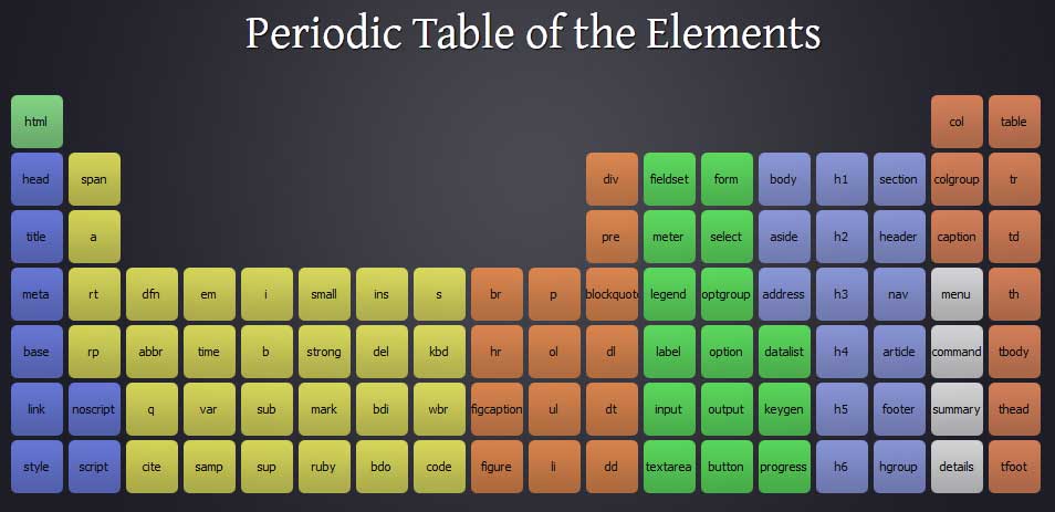
  Periodeic table of HTML5 Elements, arrange by type.