Optimal Line Length Principle Applied to Web Design
The other day I pointed out some of the differences between web design and print design. It started me thinking about some of the things I learned as a print designer that are also applicable to web design. One of the most useful is the Principle of Optimal Line Length. It states that, for any given font-size of a multiple-line block of type (like a paragraph), there is a range of line lengths and line-heights that most people consider easily readable.

Those 3 attributes—font-size, line-height, line length—are inter-related.* Change one, and you may need to change at least one of the others for most people to consider the text readable. In simple terms it means that, the wider the line length, the greater the line-height must be. Or, the bigger the font, the wider the line length. Or, the greater the line-height, the bigger the font.
Below is an illustration meant to demonstrate the relationships between the 3 attributes. In the top section are 2 blocks of text, each with 13-pixel font-size and 16-pixel line-height. Too my eye (and this is why it’s called a principle, not a rule that has formulas and ratios), the wider lines look too tight and dense. However, with the same font-size and line-height in a much shorter line length, I think it looks very readable.
Below that is a section that includes the same font-sizes (13 pixels) with a line-height of 22 pixels. Further below that section are font samples that also have a line-height of 22 pixels, but a font-size of 18 pixels.
So how does this apply specifically to web design? Because of my awareness of the principle, I always consider the line length as well as the font-size when specifying line-height. Also, I never create “fluid” layouts that expand the width of an area that contains text, because sooner or later, the expanded or contracted line length will make the text unreadable (in my and many other people’s opinions). I love IE7’s (never thought I’d be say I love anything about IE) and Firefox’s “scale-up” feature, because when a viewer wants to make the font bigger, it makes everything bigger (line-height and line length), preserving the optimal line length relationships.
Because it’s a principle rather than a rule, designers have some latitude in which to exercise their judgment. As a web designer concerned with readability, I look for the “sweet spot,” in which font-size, line-height, and line length allow people to read multiple-line text blocks comfortably and easily.
 A Light weight, small framework for beautiful forms: Ideal Forms
  How to Start a Functioning Website Under Thirty Dollars 2021?
  The HTML5 Time Element Is Back and Better Than Ever
  Mozilla Introduce Firefox 9, with Speed and less memory improvements
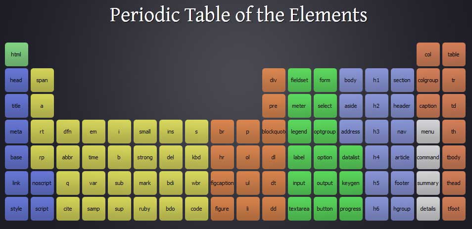
  Periodeic table of HTML5 Elements, arrange by type.