Free Pure CSS line graphs
I often think about ways to visualize data using pure css. A while ago I wrote an article about pure css bar graphs, but what puzzled me lately was a solution for doing line graphs using nothing but css.
Many will not see much sense in this technique, specially when we have so much JavaScript (or even Flash) based line graph scripts.
My intention was not only to enable data visualization to people that don’t feel comfortable with using various scripting languages but also to demonstrate the power of css and present a way of using css a bit differently. If you are not a fan of line graphs and data visualization in general, you may still read this article and think of it as css experiment and perhaps learn a thing or two about css sprites and positioning.

Take a look at the demo | Download pure css line graph
So, the line graphs. What are they good for? I will mention just one reason, and leave other advantages or downsides for a debate: users scan your page, they don’t read every word and number you write. Line graphs will deliver information much faster then a table filled with numbers.
How does this thing work?
This technique takes structured html, replace text with images and by using css sprites and absolute positioning it creates a simulation of a line graph. As in my pure css bar graph example, I am using definition list element (DL). DL element is styled to represents the coordinate system where we place items. For that reason, empty DL element must look something like this:

The dimensions used in the background graphic define the dimensions we’re using for child elements in order for everything to fit well. In this case, each item will represent one day. For items we are using DD elements with nested spans. We are formatting and placing the DL’s so they form linear bars across the chart.

The styling of nested spans are what makes this css line graph possible.
The Graph Principle
The concept may seem a bit advanced but if you look carefully into it you’ll see that the logic is quite simple. In my example item’s (DD’s) dimensions are 33px in width and 330px in height. Each one of those items represent one “line movement” from one point to the other. We’re using one image, css sprite, that has all possible options displayed graphically. As you can see on the image, there are lines that go up (rising values) and lines that go down (falling values). Setting the nested SPAN’s background-position property to certain values we are choosing one of the “line” options.

But that is not all. We also have to set the “starting position” for each item as the lines always start at different values. That is done by setting top value for each SPAN

For this reason, each SPAN has 2 (actually some of them have 3 – read below) class names attached: one that defines the SPAN’s “starting point” (SPAN’s top value) and other that represent the rising or falling “line move” (SPAN’s background position value).
Starting point is based on previous value. You have to continue with next item where the previous item “stopped”.
Usage
If you look at the css file I created 4 groups of class names: 2 for setting starting position and 2 for defining the “move”.
I divided starting position class name groups based on the situation where we are increasing values (using line-up, the upper part of the image) or decreasing values (lower part of the image).
I named those class names .pi1 or .pd1 (“p”osition “i”ncreasing 1) or (“p”osition “d”ecreasing 1) By looking at the css file you’ll notice that .pi group has negative top values which shits sprite image up while .pd group has positive top values (shifts image down).
Actual line movements are defined with class names like .i1 or .d1 i.e. this class name .i24 increases the value by 24 points.
Choosing a proper position (“.p” class) is fairly easy: you have to take a look at previous item which can be something like:
<dd><span class="pi1 i10"><em>33</em></span></dd>
We have pi1 and i10. It means that we have item starting at point 1 and is increased by 10 points. That makes point 11 our new starting point. If our next move is increase we are choosing .pi11 but if we’re decreasing we choose .pd11!
If this sound to complex (or if I presented it poorly) just remember that when choosing both class name you have to be careful that you don’t mix i’s and d’s
This is good:
<dd><span class="pi1 i10"><em>33</em></span></dd>
and this isn’t
<dd><span class="pi1 d10"><em>33</em></span></dd>
Now, let me explain what’s with the EM element. Items are placed next to each other without overlapping so the line connections are not smooth. I am using EMs to place dots over these connecting points to cover them. EMs are absolutely positioned to cover the PREVIOUS line connection area. There is one default css definition for EMs although the decreasing items need additional class name .d – that’s why I mentioned that some of the SPANS has 3 class names. The decreasing item is marked up like this:
<dd><span class="pd10 d d1"><em>46</em></span></dd>
Please note that class names are written in “points” or “steps” not the actual values. In my case each “point” represents 3,3%
As mentioned, I am not trying to replace advanced JS or flash techniques with this. I am offering an alternative way to visualize data and perhaps different view of CSS usage. This method has it’s limitations, but it’s pure CSS!
 A Light weight, small framework for beautiful forms: Ideal Forms
  How to Start a Functioning Website Under Thirty Dollars 2021?
  The HTML5 Time Element Is Back and Better Than Ever
  Mozilla Introduce Firefox 9, with Speed and less memory improvements
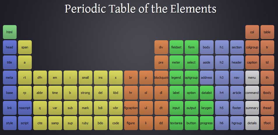
  Periodeic table of HTML5 Elements, arrange by type.