Best CSS Tips, How to Creating rounded corners box,
One of my favorite sites is definetely DeviantArt. Is a great source of inspiration when you are a bit lost, and it also has a great amount of brush resources and free stock photography. So check it out 
I was browsing the site yesterday and I wanted to know how they were doing their rounded corners. So I grabbed my little friend Firebug (if you don’t have it, go and get it. It’s definitely a must) and I inspected them. I found what they were doing very interesting and I wanted to share it with you.

Demo
Because we always understand it better with a demo:
Visit an online demonstration.
Why their technique is cool?
- No images
- 100% Crossbrowser (Tested in IE6, IE7, IE8, FF, Safari, Opera and Chrome)
- Dimention freedom. Can have any size and never break.
- You can have multiple box styles by just changing few lines in your css.
- Lightweight
Well, here is the catch. We must generate a code that is not semantic. A bunch of spans/divs or whatever you like with no content.
Then why are you showing me this?
Because with a little javascript (Jquery) we can include these elements easily and POOF, our un-semantic code is gone
Let’s get started.
The HTML
Never mind the class names. They are for explainatory purposes. Use shorter names if you want of course.
The final code when the javascript is done:
<div>
     <div>
          <p>The content of the rounded box.</p>
     </div>
</div>{code}
The inner div is necessary. You’ll see that later.
The code before making our javascript:
The amount of tags we need will be relative to the corner size. The bigger the corner, the more tags we need.
You can choose any HTML tag you want to make this. I will be using divs and spans.
The tags that will create our corners are the following:
The top corners
<div><span></span></div>
<div><span></span></div>
<div><span></span></div>
<div><span></span></div>
<div><span></span></div>
<div><span></span></div>{code}
Class c stands for corner. Class t stands for top, and class tx for the number.
The bottom corners
<div><span></span></div>
<div><span></span></div>
<div><span></span></div>
<div><span></span></div>
<div><span></span></div>
<div><span></span></div>{code}
Class b stands for bottom and class bx for the number.
I’m using 6 divs due to my corner’s size. This will depend on the corner radius you are planning to make (as I said before).
This would be the final code for each box before creating the javascript:
<div>
     <div><span></span></div>
     <div><span></span></div>
     <div><span></span></div>
     <div><span></span></div>
     <div><span></span></div>
     <div><span></span></div>
     <div></div>
          <p>The content of the rounded box.</p>
     </div>
     <div><span></span></div>
     <div><span></span></div>
     <div><span></span></div>
     <div><span></span></div>
     <div><span></span></div>
     <div><span></span></div>
</div>{code}
As you can see, if we don’t integrate this technique with javascript it totally sucks, because it’s extremely hard to manage and maintain. But with the integration with Jquery it goes really smooth. When we create new content we won’t even worry about this.
Now let’s look at the CSS Code, the one that makes the magic.
The CSS code
My divs will have borders. To to this, I will assign a border on both left and right sides of the extra elements, and give them a margin too. With only that, the corners will be done
1) Simple reset + body tag
* {padding:0; margin:0;}
     body {background:#D6DED4; font:85%/150% Helvetica, Arial, sans-serif; padding:20px 0;}{code}
2) The box
.cornerBox {width:600px; margin:50px auto;}
     .cornerBox-content {padding:20px;}{code}
- We define a width and margin (just for the example. It’s not really necessary).
- We apply a padding to the content (just for the example too).
3) The corners and their borders
.c, .c span {height:1px;}
     .c span {display:block; overflow:hidden;}

     /* borders */
     .cornerBox-content,
     .c span {border-left:1px solid; border-right:1px solid;}{code}
We define a height of 1px to every extra element and apply a display:block; to the span inside. The overflow hidden property is there due to IE6. If we don’t use it, it creates something weird.
4) Making the curve:
A rounded cornered box has a symmetry between the top curve, and the bottom one:
As this little sketch shows, the first top element’s width (t1) is equal to the last bottom’s one (b6). This can be applied to the rest of the elements too, because their distances are just the same, but inverted.
Taking this into consideration, we can define the left and right margins to both the original and the inverse element at the same time. So, let’s create the curve
.t1, .b6 {margin:0 7px;}
.t2, .b5 {margin:0 5px;}
.t3, .b4 {margin:0 3px;}
.t4, .b3 {margin:0 2px;}
.t5, .b2 {margin:0 2px;}
.t6, .b1 {margin:0 1px;}
     .t1 span {border-top:1px solid;}
     .b6 span {border-bottom:1px solid;}
{code}
Of course the first top element (t1) and the last bottom element (b6) have a top and bottom border to assure that the border doesn’t break.
The code is ready. Now we just have to add id’s or classes to style each box as we like. We can style them completely differently with just a few lines. I’ve got three examples:
Type 1: #cBox1
The code:
/* Box 1 */
#cBox1 .cornerBox-content,
#cBox1 .c span {background:#FFF; border-color:#BED2CD;}
{code}
The result:

Type 2: #cBox2 (Other colors)
The code:
/* Box 2 */
#cBox2 .cornerBox-content,
#cBox2 .c span {background:#728776; border-color:#4E6257; color:#FFF;}
{code}
The result:

Type 3: #cBox3 (With a gradient)
The code:
/* Box 3 */
#cBox3 .cornerBox-content,
#cBox3 .c span {border-color:#728776;}

#cBox3 .t span {background:#C5D3C3;}
#cBox3 .b span {background:#B2C3B0;}

#cBox3 .cornerBox-content {color:#333F35; background:#B1C3B0 url(../images/box3.png) repeat-x 0 0;}
{code}
The result:

That’s easy!
Finally, the Javascript (Jquery)
Create a variable for the top corners and another one for the bottom corners. They will have all the extra elements.
var topCorners = '
     <div><span></span></div>
     <div><span></span></div>
     <div><span></span></div>
     <div><span></span></div>
     <div><span></span></div>
     <div><span></span></div>
';
var bottomCorners = '
     <div><span></span></div>
     <div><span></span></div>
     <div><span></span></div>
     <div><span></span></div>
     <div><span></span></div>
     <div><span></span></div>
';{code}
Now apply them before and after the box’s content:
$('.cornerBox-content').each(function(){
     $(this).before(topCorners);
     $(this).after(bottomCorners);
});
{code}
That’s it!
Final thoughts
The smaller the corner, the less noticable is the element separation. A less contrasting border from the background too.
Because whether you like it or not the corners seem kind of pixeled.
The technique is very versatile and especially interesting to use in large sites. Be creative and explore the possibilities…
 How to Start a Functioning Website Under Thirty Dollars 2021?
 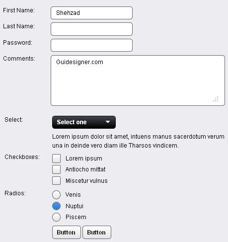 A Light weight, small framework for beautiful forms: Ideal Forms
 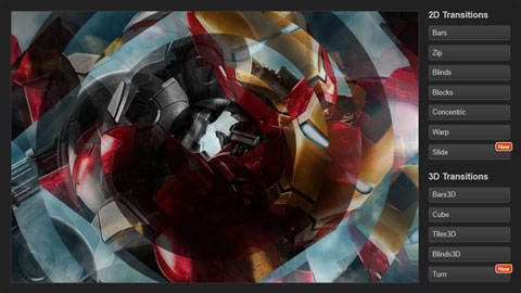 CSS3 Powered jQuery Image Slider for 2D or 3D transitions – Flux Slider
  Now Easy to Convert Websites Into Mobile Quickly: Mobilize.js
  The HTML5 Time Element Is Back and Better Than Ever
  Mozilla Introduce Firefox 9, with Speed and less memory improvements
 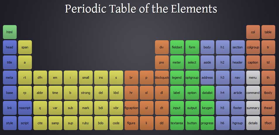 Periodeic table of HTML5 Elements, arrange by type.