Best New Essential CSS3 Techniques Revealed
This article presents 7 New CSS3 techniques that every web designer and developer should be aware of. CSS3 for sure will leads to greater flexibility and make effects that was previously complex and difficult to create much easier. Unfortunately it is not currently all the leading browsers that support CSS3. In some cases other techniques are available making our life easier while waiting for CSS3 to break through and these will be briefly covered as well.
Be aware that CSS3 features are not yet accessed directly in most browsers and in some it is not even implemented at all, ex. Internet Explorer. Firefox use a prefixed with -moz-, resulting in fx. -moz-box-sizing. Safari 3 / WebKit uses -webkit-box-sizing and Opera just accepts plain box-sizing. Coding CSS3 is therefore currently a bit irritating as you have to write the same code multiple times with different prefixes. Anyway playing with and understanding the oppertunities that new features in CSS3 will offer is is worth investing a bit of your time for.
Border Radius: Create rounded corners
There are many ways to create rounded corners on boxes. The simplest techniques rely on the addition of extra mark-up directly to your page, while the more complicated ones add the mark-up though DOM manipulation. While most of these techniques are interesting to investigate, they are not really elegant. The strength and main goal of CSS is to separate content from presentation, yet using these techniques we are adding “unnecessary” mark-up to our code in order to create a visual effect. The reason that all these creative techniques have been invented is simple. With CSS2.1 we can only assing a single background image per element.
The good news is that W3C has offered some new options in CSS3. With CSS3 you’ll be able to add not one, not four, but eight background images to a single element. This means you’ll be able to create all kinds of interesting effects without the need of those additional elements. CSS3 is also adding border-radius that may eliminate the need for images to create rounded corners in most cases. Both Mozila/Firefox and Safari have implemented this new function, it’s not supported in any IE yet. Below you will see an example:
<div style=" background-color: #ccc;
-moz-border-radius: 5px;
-webkit-border-radius: 5px;
border: 1px solid #000;
padding: 10px;" >

See working example here.
Anti-aliased Rounded corners with JQuery
The “Curvy corners” script was orgionally developed by Cameron Cooke, I (Mike Jolley) have since modified it for use in JQuery. The end result is a JQuery optimised file, much smaller in size, and working perfectly. Packed it is just 9kb in size!

jQuery Canvas Rounded Corners
jQuery Plug-in to make rounded corners on your DOM objects using <canvas> element. Tested in IE7 and FF3

jQuery Corners
This jQuery plugin will easily create beautifully rounded corners. No images or obtrusive markup necessary.

Tutorials:Rounded Corners
This is a really good tutorial showing you how to add rounded corners to an element, using no extra markup.

Border Image
The new CSS3 property border-image is also worth investigating. It is not supported in all browsers yet but it can be used to create really cool visual effects. Border-image, allows an image to be used as the border of an element. Each side of the image corresponds to a side of the HTML object. Supported browsers are currently Firefox3.1 and recent releases of Safari and Chrome. The imag below illustrates the concept:

Here is an example of code that generates the first box in the image below.
<p style="margin: 0 30px; width: 227px; padding: 14px;
-o-border-image: url('image-border.png')29 29 29 29 round round;
-icab-border-image: url('image-border.png')29 29 29 29 round round;
-khtml-border-image: url('image-border.png')29 29 29 29 round round;
-moz-border-image: url(image-border.png')29 29 29 29 round round;
-webkit-border-image: url('image-border.png')29 29 29 29 round round;
border-image: url('image-border.png')29 29 29 29 round round; border:
double orange 1em;">Lorem ipsum dolor sit amet.</p>
See working example here looking like below if you have one of the supported browsers. As you can see it is not that easy to make it nicely with width and height.

Text-shadow
If the design you are implementing requires fancy effects on text like fx. drop shadow this is likely to be done as images fx. created in photoshop. In CSS3 the need for Photoshop to create simple shadow has been eliminated. The text-shadow property is used as follows:
text-shadow: 2px 2px 2px #000;

See working example here looking like above if you have one of the supported browsers (I have ued Chrome to create the image above). Opera, Konqueror, iCab and Firefox 3.1a should also be supported.
jQuery DropShadow
You can also use this jQuery pluginto create good looking drop shadows – even on images (see the cog wheel below)

Tutorials:Wrapping Images With A Drop Shadow
The design method works its magic by nesting divs that have no semantic or structural value. If that bothers you (and there are good reasons why it might), this is not the tutorial for you.
Some CSS techniques require “extraneous” markup because currently only one background image can be assigned per element. Here’s how jQuery attacks the problem.
 $(document).ready(function(){
   $("img.dropshadow").wrap("<div class='wrap1'><div class='wrap2'>" +
     "<div class='wrap3'></div></div></div>");
 });

box-sizing
The old problem of having to use the conventional Level 2.1 box model in conjunction with padding and/or border values is solved using CSS3. Up until now, this problem was a major stumbling block for developers, particularly in the instance of specifying a border/padding value in relation to a fluid length element, but the new ‘box-sizing’ property answers this problem.
There are currently two values in the official spec- ‘content-box’ and ‘border-box’ so we can choose whether the width set on an element will include borders and padding or whether borders and paddings will be added to the width.
- ‘content-box’ – “This is the behavior of width and height as specified by CSS2.1. The specified width and height (and respective min/max properties) apply to the width and height respectively of the content box of the element. The padding and border of the element are laid out and drawn outside the specified width and height.”
- ‘border-box’ – “The specified width and height (and respective min/max properties) on this element determine the border box of the element. That is, any padding or border specified on the element is laid out and drawn inside this specified width and height. The content width and height are calculated by subtracting the border and padding widths of the respective sides from the specified ‘width’ and ‘height’ properties.”
Example code, see working example here looking like below if you have one of the supported browsers (I have ued Chrome to create the image below).
 -moz-box-sizing: border-box;
 -webkit-box-sizing: border-box;
 -ms-box-sizing: border-box;
 box-sizing: border-box;

CSS attribute selectors allow us to pinpoint the values of attributes of an element and to style that element accordingly. CSS3 introduces three new selectors that can match strings against an attribute value at the beginning, the end, or anywhere within the value. This provides powerful new ways to style elements automatically that match very specific criteria. One example could be using CSS to add an image to all links having file type .pdf. This can be aheived with this simple code:
a[href$='.pdf'] {
 padding-right: 20px;
 background: url(pdf.png) no-repeat right;
}

Other relevant uses could be mailto, rss or .mov for links or it could be interesting to test on the title value and apply specific formatting if the value is “home”. As you can imagine the possible use cases are nearly endless.
a[href ^="mailto:"] {...
a[href$='.rss'], a[href$='.atom'] {...
a[href$='.mov'] {...
p[title^="home"] {background: green;}
Example code, see working example here looking like below if you have one of the supported browsers (I have ued Chrome to create the image below).
Transparency & Opacity
The most widely implemented feature of CSS3 up till now is opacity. ‘opacity’ sets the value to how opaque an elements. An element with opacity value 1.0 will be fully opaque (visible) while an element with opacity value 0.0 will be the complete opposite, invisible. Any value inbetween will determine how opaque (or transparent) the element is.
<img src="opacity.png" style="margin: 10px; opacity:0.25; width:179px; height:76px;"/>
<img src="opacity.png" style="margin: 10px; opacity:0.50; width:179px; height:76px;"/>
<img src="opacity.png" style="margin: 10px; opacity:0.75; width:179px; height:76px;"/>
<img src="opacity.png" style="margin: 10px; width:179px; height:76px;"/>

Gradient jQuery plugin
It allows you to define a gradient fill and have an element filled with a gradient. You can set the direction of the gradient (right-left or up-down) and the opacity of the gradient easily.

Multiple Backgrounds
CSS3 allows for multiple background images on one element. This feature is not implemented in all browsers yet but once it is it will be a real time saver. This means that you will be able to make effects much easier. Effects that requires 4 elements with CSS2.1 now will only requre one element. You can separate backgrounds by commas, like this:
div.multiback {
 height: 200px;
 width: 720px;
 padding: 150px 20px 20px 20px;
 background: url(top.png) top left no-repeat,
 url(banner.png) 11px 11px no-repeat,
 url(bottom.png) bottom left no-repeat,
 url(middle.png) left repeat-y;
 }
This CSS code will generate the following effest. See working example here looking like below if you have one of the supported browsers (I have ued Chrome to create the image below).

CSS Multiple, Layed Backgrounds with jQuery
The Background Layers plugin reduces the amount XHTML you need to write simply by adding a few lines of JavaScript, making your code much less cumbersome. The concept is similar to the use of layers in Photoshop, one background image on top of another.
<pre lang="xml"><script type="text/javascript">
  $(function(){
    $('.outerBox').add_layer("#679cc6");
    $('.outerBox').add_layer("url('/images/l.png') left repeat-y");
    ...
<div style="height: 100px; width: 100px;">Test 1</div>
<div style="height: 200px; width: 400px;">Test 2</div>

word-wrap
The word-wrap property was invented by Microsoft and added to CSS3 and it is really essential. There is nothing as long words that can make web design break. The CSS3 word-wrap property will change this as it allows long words to be able to be broken and wrapped onto the next line. It takes in two values; normal or break-word.
In the first paragraph below, normal is used. This is the same as if the property wasn’t used, i.e. the long word breaks out of the box as there isn’t enough width for it to be fully contained in the box. In the second paragraph, break-word is used and the long word is broken into two pieces, so that the second part wraps onto the next line.
<pre lang="xml"><p style="word-wrap: break-word;...
This CSS code will generate the following effest. See working example here looking like below if you have one of the supported browsers (I have ued Chrome to create the image below).
<img src="http://www.tripwiremagazine.com/wp-content/uploads/images
/stories/Articles/css3-techniques/word-wrap.jpg"
 alt="css3 techniques" width="395" height="365" />
This is currently supported in IE, Safari, and Firefox 3.1 (Alpha).
 How to Start a Functioning Website Under Thirty Dollars 2021?
 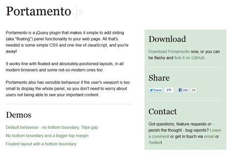 A Simple jQuery Plugin For Flexible Floating Panels With Portamento.js
 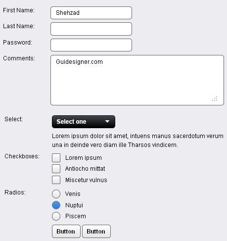 A Light weight, small framework for beautiful forms: Ideal Forms
 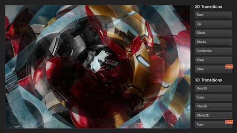 CSS3 Powered jQuery Image Slider for 2D or 3D transitions – Flux Slider
 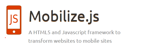 Now Easy to Convert Websites Into Mobile Quickly: Mobilize.js
  The HTML5 Time Element Is Back and Better Than Ever
  Mozilla Introduce Firefox 9, with Speed and less memory improvements
  Periodeic table of HTML5 Elements, arrange by type.